The all-new 2022 Lexus NX’s most important change, improvement and missed opportunity is its equally new Human Machine Interface infotainment system. It also has implications for the entire Lexus brand, because it signals the demise of the unloved Remote Touch tech interface.
That such an important development arrives on one of the brand’s cheapest vehicles may seem surprising, but it’s consistent with the brand’s product cycle: Remote Touch’s first major upgrade, the infernal touchpad, actually debuted on the original NX. We didn’t like it 2014 and that never changed. The new “Human Machine Interface” touchscreen isn’t perfect, but it’s still a vast improvement. Or rather, both touchscreen choices are vast improvements: a 9.6 unit base unit and a 14-inch widescreen upgrade included in Luxury and F Sport trims.
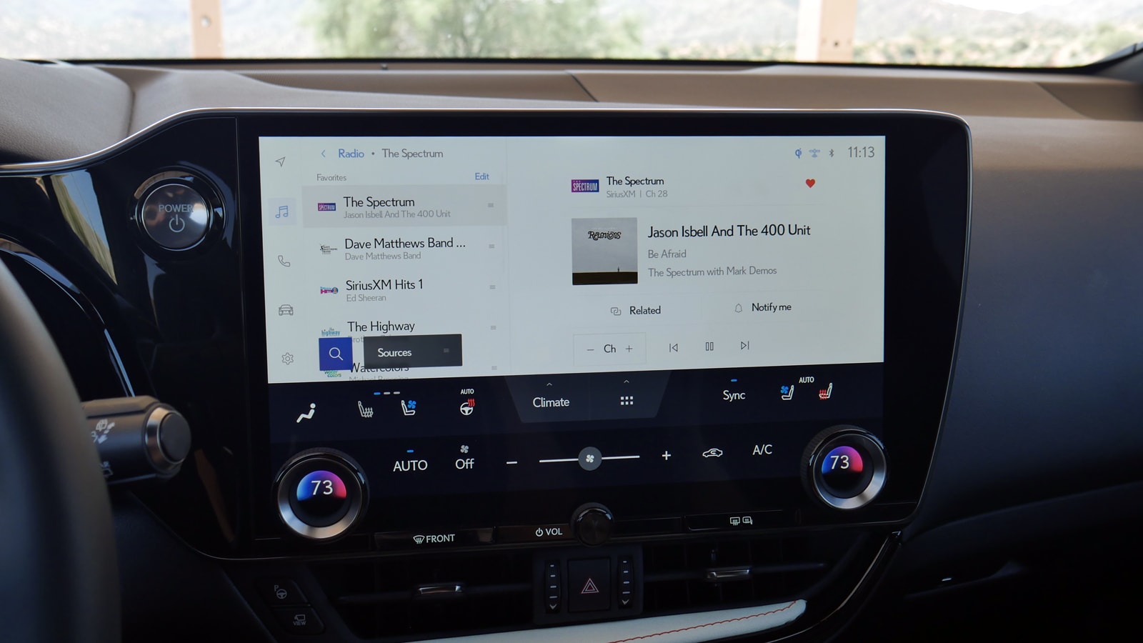
Both share a common, all-new interface developed in the United States that will spread throughout the Lexus lineup. Regardless of size, the screen’s lowermost portion is devoted to the climate controls, with physical temperature knobs sticking around along with defroster buttons. The touch icons are large enough, don’t omit frequently used choices and always remain on the screen.
So does the row of menu icons on the screen’s left side, making it easy to go back and forth between screens. Unusually, though, there is no home screen, nor the ability to split the screen to show two sources – for instance, Google Maps on the left and radio information on the right. This would be one of the aforementioned missed opportunities, especially on the 14-inch unit, as split-screen functionality is usually a key benefit of a widescreen format. Not only do rival brands like BMW and Genesis offer this, so do the widescreen displays of Lexus Remote Touch and some Toyotas.
According to Technical Communications Lead Chris Pedregon, the decision to only show one thing at once was to highlight the new natural voice command functionality and to “minimize the touch-touch-touch” of using a touchscreen. She also noted that people did not like that the old Lexus NX only had a split screen. Another Lexus representative noted that secondary information, say that radio information, can be shown in the instrument panel.
That’s the argument, here’s the refutation. First, saying “Hey Lexus” followed by a command can be just as frustrating and/or futile as it is with any other voice recognition system. Second, this argument implies that touchscreens are only used to control things, but they also display information. Being able to simultaneously see nav directions and that it’s Lord Huron playing on Sirius 28 is easier, quicker and safer than pressing an icon to go between screens or asking, “Hey Lexus, what band is playing?”
The old NX had a much smaller conventional display less suited to being split that was controlled by Remote Touch. Apples and rotten oranges. And what about the instrument panel readout? Other cars offer that and split screen functionality, and furthermore, is it really the best idea to stuff even more secondary information next to vital info like speed? What if I like keeping track of fuel economy or miles to empty?
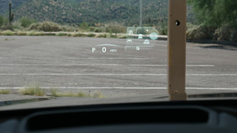
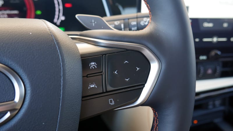
Then there’s the new head-up display and steering wheel combo included in trims that also get the 14-inch screen. It’s a unique setup. The buttons on the steering wheel are unmarked – their functionality is indicated by pop-ups in the head-up display. Touch a directional pad on either side, and a graphic depicting what each direction point does show up in the HUD. This is a novel idea, but it’s a bit confusing, and if you have polarized sunglasses that wipe out a HUD, good luck. And it’s not just infotainment functions or deep-dive, rarely used functions controlled by this; it’s the cruise control too.
So yeah, I have issues with its functionality. That said, at least the touchscreen’s new UI is quicker, prettier and is otherwise easier to use than Remote Touch. Apple CarPlay and Android Auto are also now included, and work much better with a touchscreen. Despite all the above nitpicks, I was still able to jump into the new NX and quickly figure it all out, which definitely can’t be said of other luxury systems that continue to perplex after multiple uses, including Mercedes’ MBUX and the Lexus Remote Touch system.
It’s also very important to note that the new system is also capable of over-the-air updates, meaning if enough customers complain about something like a lack of split screen functionality, Lexus could potentially change things up. By contrast, there was nothing that could be done about that infernal touchpad.
Related Video:


