Under normal circumstances, one would expect an infotainment system to improve in every way as it transitions from one version to the next. Screens become more responsive, brighter and clearer. The software is tweaked to be better, and you gain more capabilities than before. That’s the way it’s supposed to work, but BMW’s iDrive 8 does not follow this line of thinking.
It hurts me to say this, too, for I’m easily the biggest advocate of iDrive 7 on staff here at Autoblog. There’s a perfect blend of hard controls and touchscreen controls for vital vehicle functions, and the iDrive knob ties it all together in a happy harmony. The software itself is glitch-free, super-quick to respond, and the menu structure makes sense. Most of us on staff would agree that these are all big pluses for iDrive 7, including my co-writer for this piece, Senior Editor James Riswick.
Both Riswick and I (Road Test Editor Zac Palmer) spent separate weeks in new BMW i4s that feature iDrive 8, and we came away with similar complaints.
Zac’s take
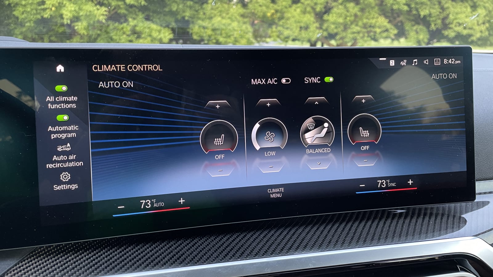
Unfortunately, iDrive 8 takes a lot of iDrive 7’s best qualities, then throws them out the window entirely for a replacement that is worse. What the vast majority of my grievances boil down to is added complexity to complete tasks. Something that could’ve been done with a single tap in a iDrive 7-equipped BMW now requires upwards of three or more taps. Take, for instance, the climate controls. BMW removed all of the hard climate controls from the center stack besides front and rear defrost, then tucked them into a new “climate menu.” Temperature control remains docked at the bottom of the touchscreen, but if you want to activate your heated seats, it requires a trip through the climate menu. The same goes for fan speed, direction of the fan and anything else you can think of re: climate controls. Predictably, it’s more time-consuming to operate and far trickier to fiddle with while driving than the nice row of buttons BMW employed previously.
Then there’s the BMW’s Dynamic Stability Control settings. There is still a hard button on the center console that you can tap to put it into “Sport Traction” mode (our favorite for enthusiastic motoring), but instead of just tapping the button, now you must tap the button, then tap twice more on the touchscreen to fully activate “Sport Traction.” Why!?
@autoblog BMW’s iDrive 8 infotainment system is a step backwards in many ways #BMW #carsoftiktok ♬ original sound – Autoblog
Meanwhile, the new settings “menu” is a maze of icons. Accessible via the home screen of customizable tiles, the new iDrive menu just looks like the app drawer of someone else’s phone you just picked up. The previously-used column style menu for vehicle settings was much more fitting for iDrive knob navigation via scrolling and rocking. This new scattershot strategy looks like it was designed to be navigated exclusively via touchscreen – and therefore staring at something other than the road for a longer period of time. More time getting accustomed to the new structure could improve matters, and heavy usage of the voice controls to find settings might help, too, but that’s a work around. The previous structure made good sense, and this one is deeply lacking.
Finally, and I know James will concur, the whole system is just slower! Apps and other items take noticeably longer to load on the screen. There’s occasional lag when touching the screen, and it’s generally less responsive/not as smooth as iDrive 7 is. This could be a result of the software being brand new with some kinks that still need working out, but this is not the direction we expect tech to move. The new iDrive 8 should be zippier and easier to use than iDrive 7, but it’s far from that now. — Road Test Editor Zac Palmer
James’ take
After about five minutes in the BMW i4, I felt like Charleton Heston at the end of “Planet of the Apes” staring up at the Statue of Liberty. “You blew it up! Damn you!”
Unlike Zac, I was never particularly enamored of iDrive 7, but at least the thing worked well and was easy enough to figure out (well, once it got its Apple CarPlay connectivity ironed out). It was largely just an evolution of what iDrive had been since around 2010 or so when BMW finally figured out how to make it tolerable. That system just so happens to be in a car I own, so it’s not like I’m ignorant in the ways of BMW.
Either way, I concur with Zac, BMW ruined its infotainment system. It is convoluted, confusing and most damningly for a brand-new system, slow! Not only do I have to tap-tap-tap through various menus, I have to wait while the computer brings up the next screen.
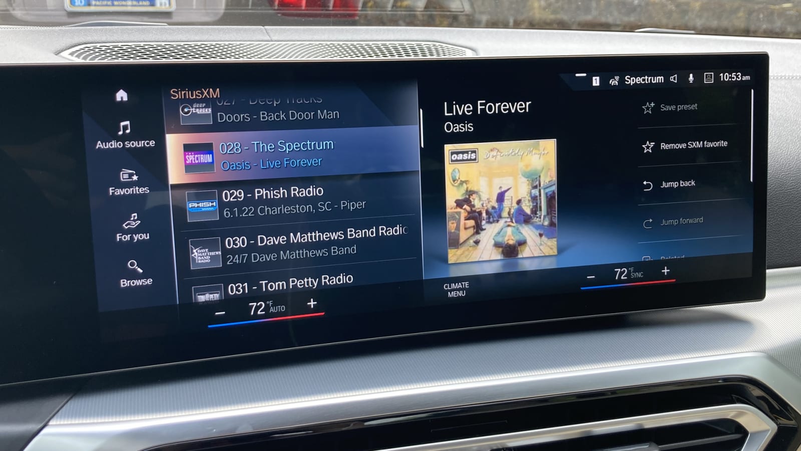
Like Zac, I had a big beef with the climate controls, but he’s already gone into that. What I want to talk about is another basic function: the radio. Now, yes, I understand that many people only listen to their own music, streamed in some way from their phones or an app, likely through Apple CarPlay and Android Auto. That’s nice. People still listen to the radio, and specifically for the purposes of this rant, SiriusXM satellite radio. I’m one of them – I even use the SiriusXM app constantly at home.
Now, whether for satellite or old-fashioned terrestrial radio, the interfaces in cars to control them have been reliant on user-selected presets (or favorites) since the 1930s. Otherwise, you’d just be spinning and spinning and spinning that dial back and forth between stations. And yet! Somehow, BMW thinks that is exactly how someone wants to interact with 470 channels of satellite radio.
Instead of defaulting back to the preset/favorites screen, the damn thing always dumps you back to the grand list of 470 channels. You’re constantly going back and forth between this default screen and the favorites list, and then, once you’ve actually selected something …
Actually, you know what? Just watch this:
@autoblog RANT: BMW has made its new iDrive tech interface worse, especially the radio interface #carsoftiktok #tech #BMW #rant #bmwi4 #cars ♬ original sound – Autoblog
The Volkswagen ID.4/GTI tech interface/nightmare has a similarly nonsensical and terrible radio setup. My guess is it was designed by someone who can’t comprehend that people still listen to the radio (even if the radio in question is basically just a streaming service with songs selected by people rather than an algorithm) and that their newfangled way was totally better. It isn’t. Even if that’s the case, why not just say “OK Elder Millenial” and give ancients like me the old thing they were used to? Why bother reinventing the wheel when you’re convinced the world has moved onto hoverboards?
Also, I don’t want to dive into a touchscreen to turn on my heated seat. Especially if that damn screen takes forever to load. Just like the ID.4, for that matter.
You blew it up. Damn you. – Senior Editor James Riswick
Related video:
Source: www.autoblog.com


