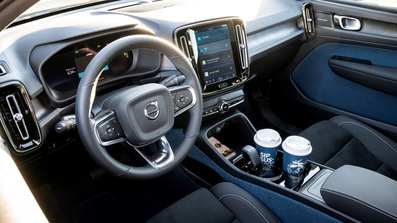
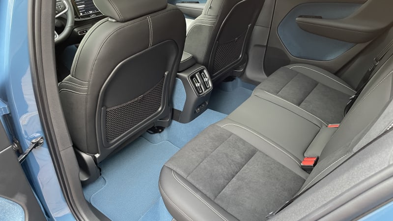
The 2022 C40 Recharge is an all-electric, all-or-nothing proposition from those delightfully stylish Swedes over at Volvo, whose designers put their typical minimalistic spin on this crossover-coupe EV. While Zac was a bit more fond of the all-blue interior in our tester than I was (you can also get it in black), I was at least equally as impressed as he was by its new tech suite. The “you can get it any way so long as it’s loaded” American-market C40 arrived sporting the latest version of Google’s Android Automotive OS infotainment system (like other Volvos).
In what may be the most stereotypical display of Silicon Valley chicanery I’ve seen so far in 2022, this new infotainment system doesn’t support Apple CarPlay at launch, so it was almost poetic when the iPhone I used to shoot the above video fought me tooth-and-nail when I tried to share it via Google Drive. Relax, iPhoners. Volvo says an OTA update with CarPlay support is coming. But let’s face it, when it comes to maps, Google is Google, and since you get it natively here, it works exactly the way you’d expect it to. Google Assistant is there to handle your voice commands too. There’s even ample room in the rear for a future Google Bathroom Attendant, should you feel that you’re just not getting quite enough Google in your diet.

If you’ve driven a recent Volvo, the infotainment system will probably look familiar to you. Despite the architectural overhaul and obvious Google ecosystem UI elements, it still feels like a Volvo system. I suppose that could be either good or bad, depending on how you feel about Volvo’s user experience, which tends to eschew menu-diving in favor of pretty much putting every possible feature on the screen at the exact same time. That may sound overwhelming, but there’s an organizational method to this pixelated madness.
Google’s approach uses a simple scroll when you run out of home screen (yes, like a smartphone) and has collapsing drop-downs in the app menu for categories with more icons than will fit in the allotted span. For apps, settings and other such menus, this works a treat. Obviously, you don’t want to be scrolling through things like cabin temperature or fan speeds, so you get more conventionally laid-out menus for both, for better or for worse. If you ask me, the heating/cooling controls are a little fussier than they need to be; I found the same to be true in our long-term S60 with the last-gen Volvo system.
Taken holistically, the C40’s interior seems about right for an electric vehicle from Volvo. Personally, I would have appreciated something that felt a bit more substantial — maybe even slightly overstated — to compensate for the inherently more-sedate cabin of an all-electric model. Unfortunately, until battery packs shrink and curb weights correspondingly subside, I think we’ll just have to expect a little less from EVs.
Related Video
Source: www.autoblog.com


